
Photo CC-BY-SA Gerry Dincher
This post on why people focus on the right-hand side of a design is an old one, but still valuable today:
These days there is a lot of talk about emotional design and how to properly create a connection between users and our products. Focusing on the right-hand side of our designs can create these connections. We have the ability to influence and change a user’s belief in what is right and honest with our designs.
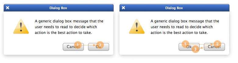
Take, for example, these simple dialog boxes (above). Which will get the best positive reaction by users? I’ll tell you: it’s the one with the positive actionable button on the right. This is because users trust that the next step will pull them forward in the journey they are on.
By having the positive action on the right, we’re helping create a more intuitive response. So why do we change this in our full sites by placing the most important and actionable elements in an area that the majority of the population doesn’t trust, connect with or find intuitively?

I landed on Wikipedia when I was trying to remember the correct spelling of the Latin sinister and dexter. There’s nothing special about the Latin spelling, as you can see, but I did find these two great articles on heraldry and science/medicine.