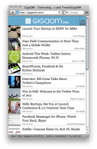
This week we launched a new mobile theme at GigaOM.com. It was out for just a day or two before Dennis Bournique surprised us with a review on WAPReview.com. I have no way of knowing if I would have linked to the review if it wasn’t positive, but I would likely have found a way to link to this advice to other developers regarding URL consistency:
A URL should lead to essentially the same content (reformatted in necessary) regardless of which browser is used. [Any website that breaks this rule] is breaking the Web’s most important feature, hyperlinking.
Most mobile themes frustrate me. At a minimum they mess with our memory of how to use and navigate the site, and too many of them strip out too many features and leave mobile users with no way of switching to the desktop version. A mobile theme done well can give Mike McCue a run for his money and deliver a website you can curl up with. I’m not claiming success in this regard, but at least this new mobile theme doesn’t break the web.
Meanwhile, here’s my tip for anybody trying to build or preview a mobile theme with a desktop browser: switch your browser’s user agent. Safari makes this dead easy. First, make sure you’ve enabled the Develop menu in the Safari preferences:
Then select the user agent you want Safari to send with each page request:
And before you know it, the site will send the iPhone or mobile-optimized pages:
The usual disclaimer: I am speaking only for myself, not my employer.


