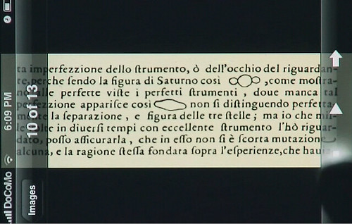
Edward “to clarify add detail” Tufte, who criticizes the PowerPointing of America, earlier this year posted a video on the iPhone’s UI design. He loves the photo viewer (except the grid-lines between images are too big), he loves the web browser (except the navigation bar takes up too much space), he calls the weather app an elegant way to demo your iPhone to friends (but says it’s devoid of information), and calls the stock market app cartoonish.
The biggest takeaway, however? “The metaphor for the interface is the information.” And on that point, he says the iPhone got it mostly right. There are definitely some examples to learn from.
