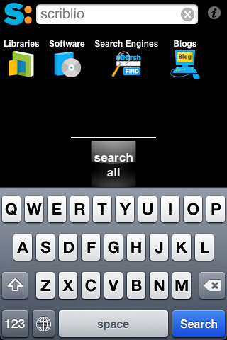
Re-imagined a bit, anyway. Why browse a vertical list of results when you can flip through them like pages in a book (or album covers in iTunes). Searchme on the iPhone and iPod touch does just that.
As you type your search term, icons representing rough categories appear, allowing you to target your search and helping people who’re searching for information about pythons the snake avoid results about the programming language. Though, in practice, the category results for “python” include “computer programming”, “web development,” but no obvious category for animals or zoological queries.
The results are displayed in a cover-flow-like interface, with each website represented by a screenshot image. The result is that you can browse through a half-dozen results much faster than you could individually load each page. Unfortunately, the search results are poor compared to Google or Yahoo (to engines I use regularly), and you’ll likely find yourself having to browse a few sites before you find your answer.
Despite these annoyances, and a few bugs, Searchme is a good reminder that new technologies offer new affordances. Cover flow offers a very simple method of exploring a dataset. I’m not convinced that web search results are well suited to it, but I can imagine a few datasets — photo archives, for example — that might be.

