I learned about serif and sans serif typefaces, about varying the amount of space between different letter combinations, about what makes great typography great. It was beautiful, historical, artistically subtle in a way that science can’t capture, and I found it fascinating.
What if Steve Jobs had gone to the Allgemeine Gewerbeschule (school)[…] instead of Reed College? What and who would have influenced his choice of typefaces for the Macintosh?
Although the idea of Steve Jobs studying type in Basel seems far-fetched, it still makes for a fascinating case of “what if?” Based on the suppositions above, there are eight typefaces that, in conjunction with Courier and Symbol, might have become the Macintosh core font set: Bauer Bodoni, Futura and Univers from Linotype; Bembo and Gill Sans from Monotype; Sabon and Times from both Linotype and Monotype; and Akzidenz Grotesk from Berthold. This set of four serif and four sans serif typefaces not only reflects the typographic tastes of Switzerland in the 1970s, but is also better balanced stylistically than the actual set2. The serif faces cover the Aldine, French Old Style, Dutch Old Style and Neoclassical categories while the sans serif faces include two grotesques (gothics), a geometric sans and a humanist sans.
Though it is fun to muse about what might have been, one must wonder how much influence Steve Jobs had over the fonts selected for the original LaserWriter. Apple licensed the LaserWriter fonts from Adobe, which had licensed them from other foundries. The LaserWriter was introduced in 1985, the same year Jobs was ousted from Apple and founded NeXT. Andy Hertzfeld tells that story at Folklore.org.
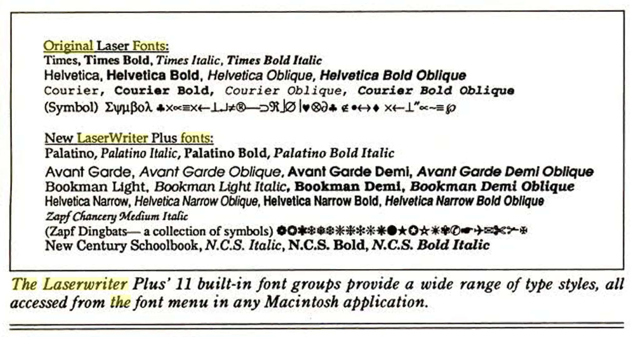
As an example of how thoroughly the LaserWriter fonts came to be identified with the Mac and to define the early days of desktop publishing, Shaw is referring here not to Kare’s bitmap fonts, but to Helvetica, New Century Schoolbook, Palatino and Times from Linotype, and Avant Garde Gothic, Bookman, Zapf Chancery, and Zapf Dingbats from International Typeface Corporation. Shaw is being somewhat dismissive of Courier, which was apparently based on an un-trademarked face of the same name from IBM’s typewriters, and Symbol (which must be acknowledged as a precursor to today’s emoji).
The 11 fonts that shipped with the LaserWriter Plus in 1996, as shown in an InfoWorld review at the time.