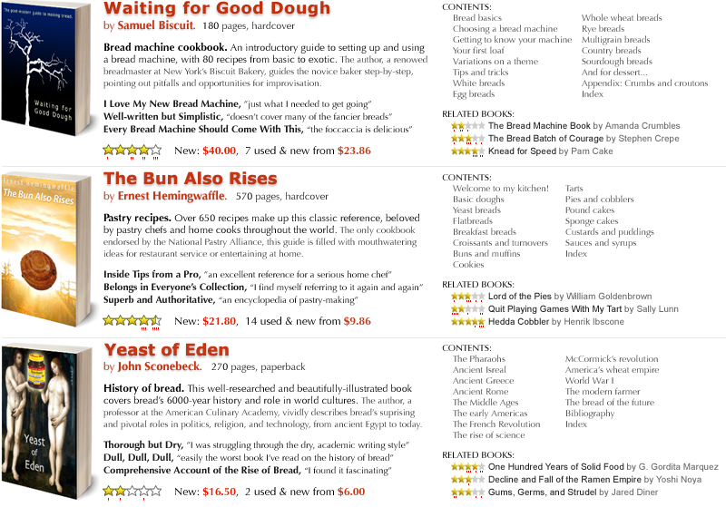
Bret Victor offers the above design suggestions (from 2006) to Amazon in the book search results display (he’s comparing to this). I didn’t discover them at the time, but many of them are still relevant now. Bret notes that Amazon’s display doesn’t do a good job of answering the questions a person has when searching for books: “What is the book about?” and “is it any good?”
Unfortunately, these questions are completely unaddressed by the information provided. To see relevant information, the user must click on each listing individually. That is, she must navigate by hand instead of by eye, and must use her memory to compare information across time instead of space.
The problem is that this graphic was designed as an index into a set of webpages, but is used as a catalog for comparing a set of books. The purpose of this graphic should not be to return a list of query matches, but to help the user learn about books related to her topic of interest.